
Tuesday, 7 May 2013


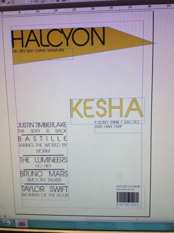
Choosing the main font

On website, Da Font I searched for some fonts that would suit my magazine genre of chart music. These fonts were my favourite and I felt they were the most appropriate. After conducting some market research, I chose 'abeat by kai' as 75% of the people asked, thought it was the most appealing and best suited font, as it is clear but has a uniqueness about it.

The background on contents page image


On the contents page that had all of the studio shots, I was told through the feedback that variety in the background of the images was needed. I liked the natural pose of the model touching her hair and brushing it off her face, so I tried to recreate this image. The colour of the jumper on the studio shot worked well on the contents as it was a good mix with the greens and bit of red from the other images. The shirt in the second photo was chosen to keep the mix. and it is the type of clothes that the target audience would wear.
Subscribe to:
Posts (Atom)